The History of R-IT Brand
Just like Raiffeisen Informatik has always adapted to the spirit of time, so did their Brand and Slogans. A quick Retrospective on the evolution of the word and figurative Brandmark, as well as the technological Spirit it captured.
Once upon a time...the Punchcard..
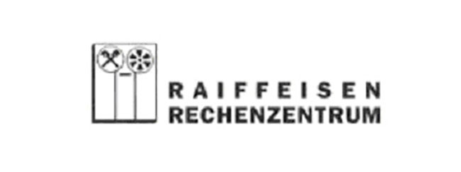
After the spinoff of IT from RZB, technically the first Outsourcing, a separate Brand was designed. Trying to create a feeling for the brand-new Data Center, pictorial Elements were essential. Because big Storage Media and Punchcard Systems were the main Characteristics of 70s IT, obviously they were go-to symbols. Apart from the Company’s name, one can recognize an old-fashioned Tape Drive. Additionally, the Company name is shown as if embossed on a punch card, state-of-the-art medium of the early days. Back then, Raiffeisen Data Center was exclusively for the Raiffeisen Sector.
As the Entirety of Punch Cards progressively got replaced by Tape Drives and other new Storage media, so did the embossed Lettering on the Logo vanish. The new version matched perfectly with the technological Progress of the 70s. Since classical brand strategies weren’t pursued yet and Logos were rarely printed onto Printouts, the Logo eventually changed a little.
The advance of the Personal Computer
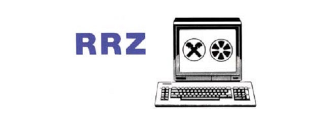
The 80s brought Personal computers (PC) that advanced unstoppably. Furthermore, Abbreviations became extremely en vogue, which resulted into the new abbreviation RRZ (Raiffeisen Rechen Zentrum/Raiffeisen Data Center). Exploring the new possibility of Colour Printing, the abbreviation was colorized blue. These two Components formed the new Logo in 1986.
Stepping into the Age of “New Economy”, a new composite Mark had to be created. The Repositioning of Raiffeisen Informatic Center to a state-of-the-art IT-Service Provider in 1993 inspired the new dynamic Structure. Choosing Red and Blue as the dominant Colours was a deliberate Step in distancing RRZ from the predominantly yellow coloured Raiffeisen Sector and clarifying its Belongingness to the IT-Sector. This Version lasted until the Turn of the Millennium, when some minor Adaptions took Place. Additionally, Brands like “Focus” of “Racon” originated from this Time and the Participation Strategy was upgraded.
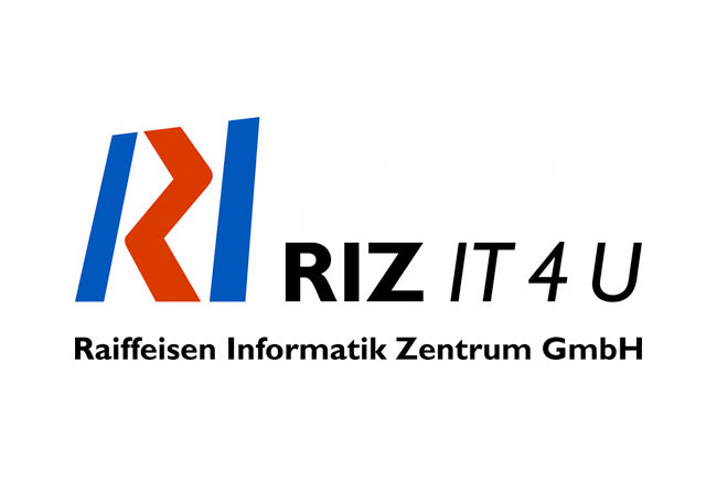
The Beginning of the Millennium came with a lot of Changes. Strategy Program RIZ4U was started, Raiffeisen Rechenzentrum got renamed to Raiffeisen Informatik Zentrum GmbH and Corporate Goals, Strategies, Visions and Missions got defined. RIZ was officially founded and from now on cherished as the well-known Abbreviation.
Simultaneously with the 35-year Anniversary of RIZ, a huge Change was made. Company Name as well as Corporate Design and Brand appeared in a completely new Look & Feel. “Back to the roots” was the guiding principle when the characteristic Raiffeisen Yellow was reintroduced to the logo and supplemented by the symbolic Gable Cross. The lettering orientated itself on the former top Institute RZB. In May 2004 the company was renamed to “Raiffeisen Informatik”.
Earthed, compact and steady are keywords that cross one’s mind whilst looking at the logo. It symbolizes Stability, Security and Trustworthiness. All of those are fundamental values of the Data Center Service Provider.
However, it was a rough start for the RI abbreviation, because on short notice Raiffeisen Bank International (RBI) changed their abbreviation to RI too. Due to that, the abbreviation “R-IT” was established for the Raiffeisen Informatik GmbH and was also carried out for its subsidiaries (RI-C, RI-S).